Lars Grammel
I create interactive user interfaces that invite people to play with and to explore data. My goal is to help everyday users in data visualization and analysis.

Interaction Design for Data Visualizations
Aug 2012
I have written a guest post about interaction design for the visual.ly blog. I explain several interaction concepts and ideas for data visualizations such as highlighting, details on demand, and multiple coordinated views using 11 interactive infographic examples from the web.
Crowd Documentation
May 2012
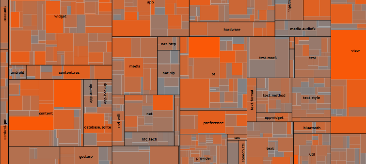
I have created a tree-map that shows how Stackoverflow posts match API usage. Users can adjust the color scheme and flexibly map API usage and documentation onto color and area. The visualization has won the visualization track of the Stackoverflow data analysis competition.
The crowd documentation visualization has been developed as part of a research project with Chris Parnin, Christoph Treude and Margaret-Anne Storey. The project explored the relationship between API usage and unofficial documentation on the web for the Android, Java and GWT APIs. The API usage was approximated by the number of search hits for class names on Google code search, and the crowd documentation for a class was approximated by the number of Stackoverflow posts containing its name.
Breeze
May 2012
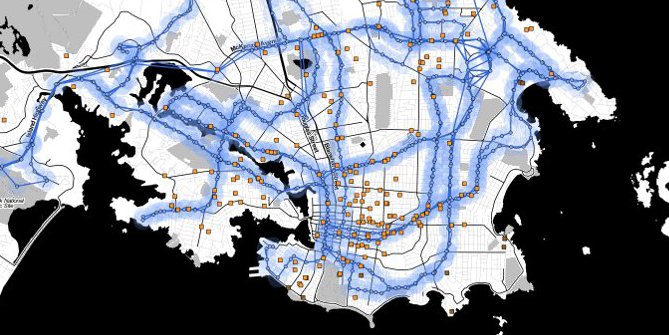
I have designed an online map that shows rentals and how close they are to bus routes. It supports dynamic queries to quickly filter the available apartments.
Breeze has been developed in collaboration with Jamie Starke to help UVic students find apartments for rent. The result is the Victoria rental map that shows apartments for rent in Victoria, BC, as well as the bus routes to UVic.
Breeze, the frontend of the rental map, is available on Github. You can fork it and make searching for apartments fun again in your city.